Ilford Exchange
At the heart of Ilford.
The Ilford Exchange has recently had an injection of funding to modernise the centre, with the end goal of increasing store occupancy and footfall. With competition from nearby Westfield Stratford, the centre required new branding to establish it as a unique shopping destination for locals in the heart of Ilford.
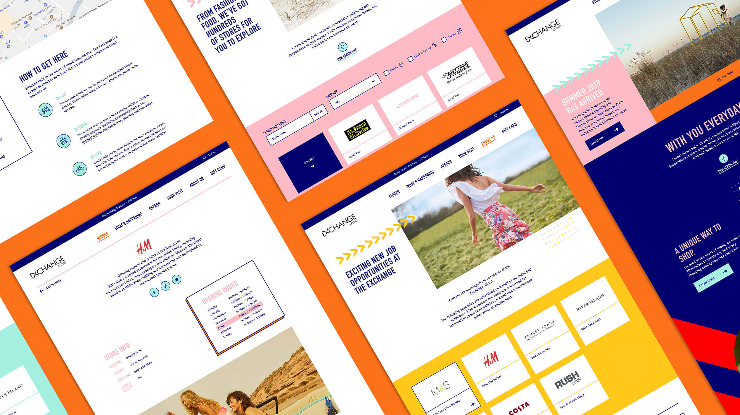
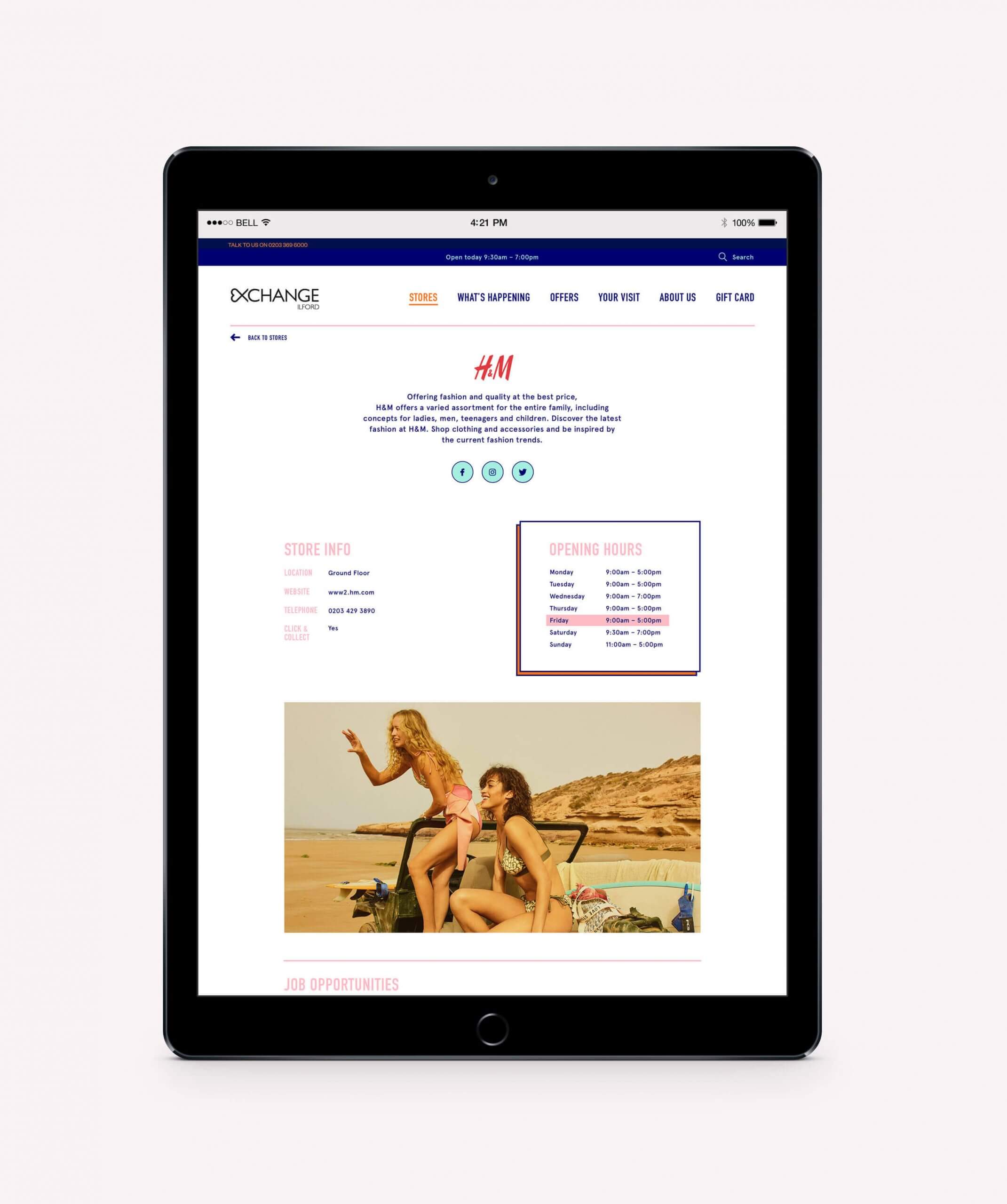
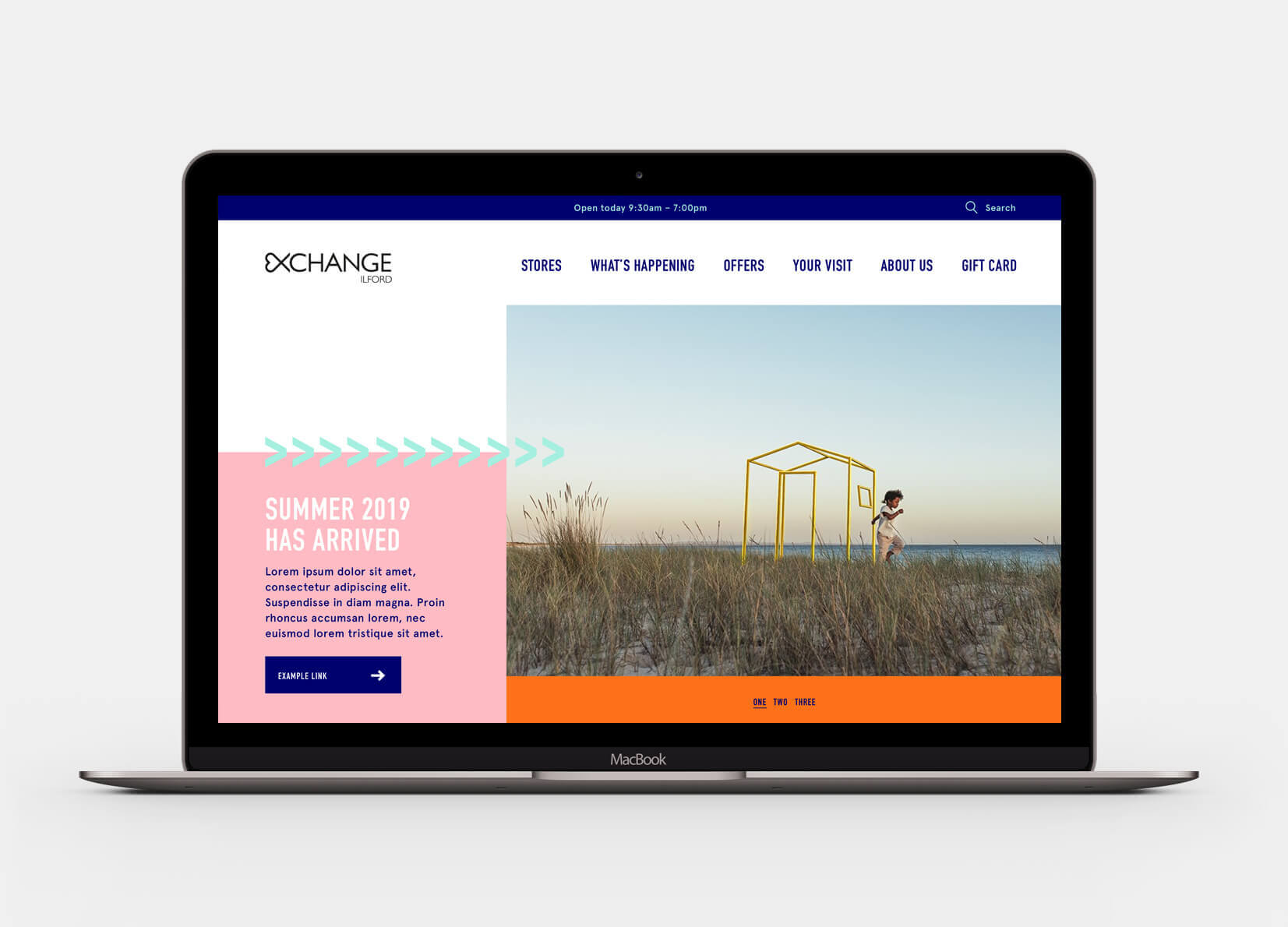
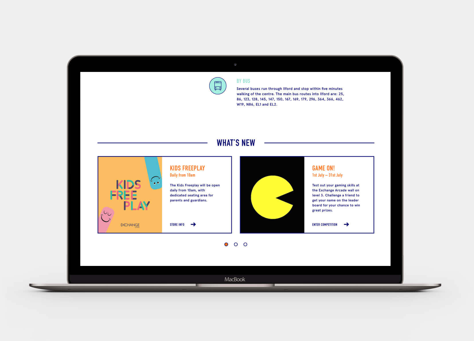
From looking at the market research, it was noted that this shopping centre was predominately used by local families, with this in mind one of the primary goals for the new positioning was to ensure it was family-focussed and friendly. This was done by creating a warm tone of voice, paired with an energetic colour scheme that used fun graphics as devices that could be incorporated into the way-finding, internal posters and for social media.
The website itself was a simple update to what already existed, as it required no extra functionality. As the colour scheme and new positioning introduced was adventurous and bold, I wanted to explore this on the website to create a memorable shopping experience for users to the centre.